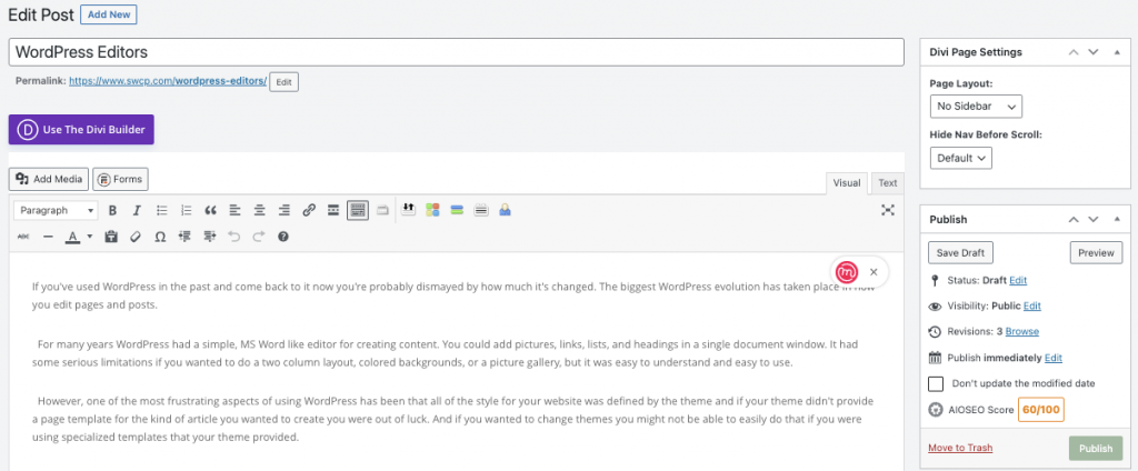
If you’ve used WordPress in the past and come back to it now you’re probably dismayed by how much it’s changed. The biggest WordPress evolution has taken place in how you edit pages and posts. For many years WordPress had a simple, MS Word like editor for creating content. You could add pictures, links, lists, and headings in a single document window. It had some serious limitations if you wanted to do a two column layout, colored backgrounds, or a picture gallery, but it was easy to understand and easy to use.

However, one of the most frustrating aspects of using WordPress has been that all of the style for your website was defined by the theme and if your theme didn’t provide a page template for the kind of article you wanted to create you were out of luck. And if you wanted to change themes you might not be able to easily do that if you were using specialized templates that your theme provided.
One of the nice aspects of WordPress is it’s easy to add functionality to your website via widgets. These are small apps that add content, like a list of recent posts, a calendar, or the contents of your shopping cart. These widgets are placed in sidebar areas that are defined by your theme.
Alternatively you can add a function with a larger footprint into the content area via a short-code. Something like a map, a full page calendar, or a shopping catalog.
Another very real problem with website design is that designing for a website is not the same as designing for print media. Print is statically sized. You only need to worry about how a page looks at the size it will be printed. A web page needs to look good on a 4K monitor and a smart phone, and all devices in between.
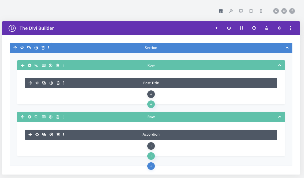
As a result many theme developers and website builders wanted new tools to allow more control over the layout of a single page, and page builders were born. DIVI, Visual Composer, WP Bakery, Elementor, and Beaver Builder are examples of these tools. Some were bundled with themes (like DIVI), some were plugins. They all allowed the content creator to break up the page’s content area into rows, columns and sections (groups of rows), which allowed the page to reconfigure itself depending on the size of the device that was viewing it. And each column in a row could have it’s own function (module). This was like having a grid that you could fill with widgets. A module can be as simple as a paragraph of text and as complex as a shopping cart.

Page Builders allowed easier access to controls for setting widths, heights, colors, and fonts without having to know Cascading Style Sheets (CSS). This was a necessary evolution make it easier to build mobile friendly websites and gave the content creator more freedom to create custom layouts and not be tied to a specific theme. This comes with a cost. It’s no longer easy to create your content in a Word document them cut and paste into your editor window. And building a page is more complicated.
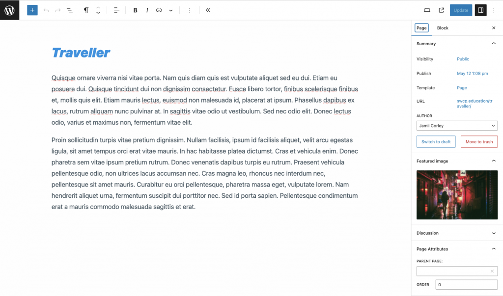
With so many choices of Pages Builders and each with its own opinion of how the interface should look, the creators of the WordPress software decided they needed to provide an editor that was block aware and Gutenberg was created. Their design paradigm was a little different because they still wanted to provide a WYSIWYG (what you see is what you get) editor, so Gutenberg divides the page up into blocks, but not a grid like most page builders. In addition Gutenberg doesn’t show you the blocks, you have to move your mouse around until it’s hovering over a block to see the structure of the page. Over time Gutenberg has given you more tools for seeing the structure of the page, but it’s not as obvious as most page builders, and initially Gutenberg didn’t support as many modules to put into the blocks.

As the block editor has been developed and made robust the question became, “why can’t I use this tool to build my entire page, header, footer, sidebars, navigation, and content?”. Several page builders expanded into the “theme building” business to allow just this. DIVI, elementor, and Beaver Builder are some that come to mind.
WordPress has a built-in solution for this called Full Site Editing. The Full Site Editor allows you to build full themes in a block editor interface. Headers, Footers, Page Templates, everything you’d normally rely on the theme to create for you, you can construct yourself.
Does this bring us full circle to having to design your website from the ground up? No, themes still exist and give you nice looking templates to construct your website, with lots of options for configuring your brand, but they also allow you to add specific elements that work for you, without having to write PHP to modify a theme, through a consistent block editor interface.
In coming articles we’ll look at how to effectively use these new editors which provide block structures.
